MoneyTrip
A mobile app that helps your budget go the extra mile
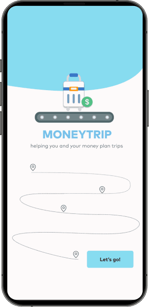
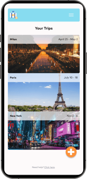
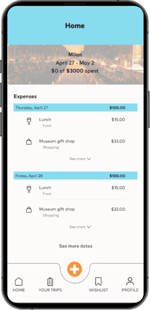
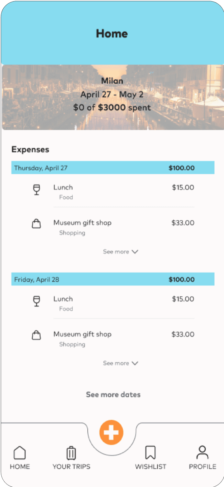
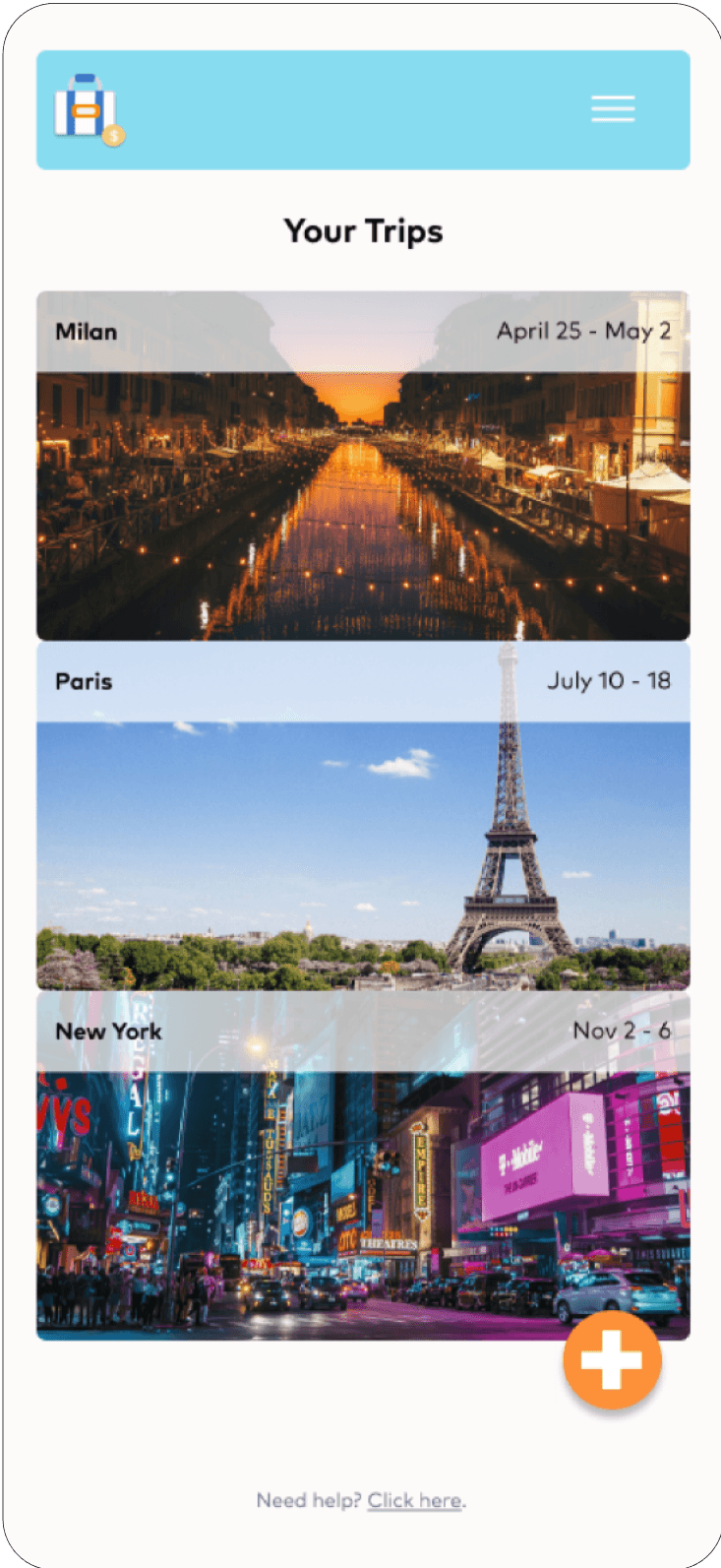
Left to right: splash page, trips page, expenses page
The problem
Creating and sticking to a travel budget is hard.
Originally, I set out to create a mobile app to help travelers put together the most efficient itinerary to optimize routes and activities.
But then I talked to them and realized that while planning definitely was a big pain point, it wasn't the biggest pain point they had. They actually needed more help with budgeting!
So my new problem was now: how can we make budgeting and keeping track of expenses while traveling easy and seamless?
The problem
Creating and sticking to a travel budget is hard.
Originally, I set out to create a mobile app to help travelers put together the most efficient itinerary to optimize routes and activities.
But then I talked to them and realized that while planning definitely was a big pain point for them, it wasn't the biggest pain point they had. They actually needed more help with budgeting!
So my new problem was now: how can we make budgeting and keeping track of expenses while traveling easy and seamless?
The solution
Make inputting expenses simple and frictionless.
Over 10 months, from August 2022 - June 2023, as the sole UX/UI Designer, I used Figma, Miro, Zoom, and Marvel to bring my vision to life.
My final product ended up being a budget and expense tracker to help travelers stick to their budget and track every last dollar being spent.
The final prototype walkthrough
The final prototype walkthrough
The final prototype walkthrough
The final prototype walkthrough
So, pivoting…
In my first round of user research I sent out a survey asking users about their travel experience and to name their biggest travel pain point.
The yellow bar, financials, had the highest number of responses.
So during my user interviews, I asked my interviewees to talk about their previous trips. They all mentioned planning and budgeting but 100% of them emphasized that creating a budget was hard, sticking to the budget was hard, and that tracking expenses while they were traveling was hard.
So users find budgeting for traveling way more annoying than planning for it! My original idea was a bust, that I already drawn up sketches and done wireframes for was a bust. Back to the drawing board…literally.

Pivoting
In my first round of user research I sent out a survey asking users about their travel experience and to name their biggest travel pain point.
The yellow bar, financials, had the highest number of responses.
So during user interviews, I asked my interviewees to talk about their previous trips. They all mentioned planning and budgeting but 100% of them emphasized that creating a budget was hard, sticking to the budget was hard, and that tracking expenses while they were traveling was hard.
So users find budgeting for traveling way more annoying than planning for it! My original idea was a bust. Back to the drawing board…literally.
Insights
The yellow bar, financials, has the highest number of responses.
Users find budgeting for traveling way more annoying than planning for it!
Prototyping and Testing
Insights
80% of the users intuitively knew what to do and needed little to no prompting to get through the app. But there were still some hiccups and confusion with certain elements.
Need bigger CTAs with text labels
No need to change standard log-in screen
Reduce the number of choices/information on the screens so users immediately know how to move on


Left to right: login page, get started page, create new trip page
Since I'm pivoting about 1/3 of the way through the project, I quickly sketch and then dive into low-fi mockups and a simple prototype. I thought the more information to help the users the better, but that I was proven wrong when it actually came to testing.

Adding a splash page
Created a splash screen and used that as the landing page instead of a log-in page
Users wanted to preview the app before deciding whether to sign-up or not so they preferred this new flow of having onboarding be later on in the process
Iteration and Improving My Designs
Removing the tutorial
Some users were confused on how to use the app in the first round of testing so I initially included a tutorial mode
Users hated the tutorial mode, actually
Removing the tutorial mode meant that I spent more time making he UI as easy to understand as possible without forcing users to rely on something else, like a tutorial


Adding bottom navigation
There was originally a hamburger menu but users didn't see the point of it
They thought that the hamburger menu included too many options that they weren't going to use
They preferred to see everything laid out in a bottom navigation bar with easy access to the tools they would most often use in the app
Conclusion + Lessons Learned
The first draft is never perfect.
You will always iterate on it, and honestly, that’s part of the fun! Seeing the different iterations become more user-friendly and beautiful was so satisfying.
Don't be afraid to pivot.
I started this project thinking I would design one product and ended up with another product altogether. It’s important to listen to the users and what they actually need so that I’m not wasting time making something no one needs.
Test early and test often.
Things that I thought would be a hit, like the tutorial mode, completely failed with users and I’m glad I could test that early on before I got too deep into it.
Always refer back to the user when unsure.
In the end, whatever I’m designing is for the user, not for me. If I come to a fork in the road, I need to put myself in the user’s shoes and make the decision that best benefits them (and then test ASAP to make sure my assumptions ring true).
Prototyping and Testing
Left to right: login page, get started page, create new trip page
Since I'm pivoting about 1/3 of the way through the project, I quickly sketch and then dive into low-fi mockups and a simple prototype. I thought the more information to help the users the better, but that I was proven wrong when it actually came to testing.
Insights
80% of the users intuitively knew what to do and needed little to no prompting to get through the app. But there were still some hiccups and confusion with certain elements.
Need bigger CTAs with text labels
No need to change standard log-in screen
Reduce the number of choices/information on the screens so users immediately know how to move on
Iteration and Improving My Designs
1. Adding a splash page
Created a splash screen and used that as the landing page instead of a log-in page
Users wanted to preview the app before deciding whether to sign-up or not so they preferred this new flow of having onboarding be later on in the process
2. Removing the tutorial
Some users were confused on how to use the app in the first round of testing so I initially included a tutorial mode
Users hated the tutorial mode, actually
Removing the tutorial mode meant that I spent more time making he UI as easy to understand as possible without forcing users to rely on something else, like a tutorial
3. Adding bottom navigation
There was originally a hamburger menu but users didn't see the point of it
They thought that the hamburger menu included too many options that they weren't going to use
They preferred to see everything laid out in a bottom navigation bar with easy access to the tools they would most often use in the app
Conclusion + Lessons Learned
The first draft is never perfect. You will always iterate on it, and honestly, that’s part of the fun! Seeing the different iterations become more user-friendly and beautiful was so satisfying.
Test early and test often. Things that I thought would be a hit, like the tutorial mode, completely failed with users and I’m glad I could test that early on before I got too deep into it.
Don’t be afraid to pivot. I started this project thinking I would design one product and ended up with a different one. Listen to what the users actually need so that I’m not wasting time making something no one needs.
Always refer back to the user when unsure. In the end, whatever I’m designing is for the user, not for me. If I come to a fork in the road, I need to put myself in the user’s shoes and make the decision that best benefits them (and then test ASAP to make sure my assumptions ring true).
Slide deck link: coming soon
Back to top
Thank you for reading!
Thank you for reading!
If you'd like to reach out or connect, please email me at: julienguyen.ux@gmail.com
If you'd like to reach out or connect, please email me at: julienguyen.ux@gmail.com
Slide deck link: coming soon

MoneyTrip
A mobile app that helps your budget go the extra mile
UX Design Case study
Add your Screen Here
Add your Screen Here
Add your Screen Here
