Designing a teacher/student dashboard to deliver actionable insights
I took complex workflows and data-heavy interfaces and shipped a digestible AI-powered analytics tool that provides recommendations for users.

Overview
The problem:
The existing interface lacked the features necessary to address teachers' core pain points, resulting in added friction rather than value
Excess unstructured data forced teachers to spend critical time digging for trends rather than utilizing data to inform student progress and interventions
The success criteria:
Increased adoption rate, proving the new features directly support the teachers' actual operational workflows
Reduce the time it takes teachers to move from data-overwhelm to immediate action
User Research
I started with some mixed-methods research that included:
research from discovery interviews by the education team
competitive and analogous research
user interviews
This led me to discover that teachers have access to lots of data but they don’t always know what to do with all that data.
I held weekly meetings with the education team and design team to make sure that what I was designing was addressing users’ real needs. This collaboration ultimately led to the creation of SPAM, or Student Performance Analytics and Metrics.

The first iteration of SPAM
User Testing and Iteration
Testing revealed a crucial flaw: showing student progress wasn't enough. Teachers explicitly needed to know what actionable steps to take next once they got insight into a student's status.
In the next design iteration, I pivoted the focus from passive monitoring to active intervention. I explored multiple directions but ultimately focused on:
Pattern Consistency: Because SPAM was launching as a brand-new feature alongside a new dashboard, keeping the UX/UI patterns consistent and intuitive prevented users from feeling overwhelmed by a dual learning curve.
Bias to Action: I structured the interface so that student progress data was directly paired with a clear action, such as reassigning a lesson or game module or generating a targeted study guide.
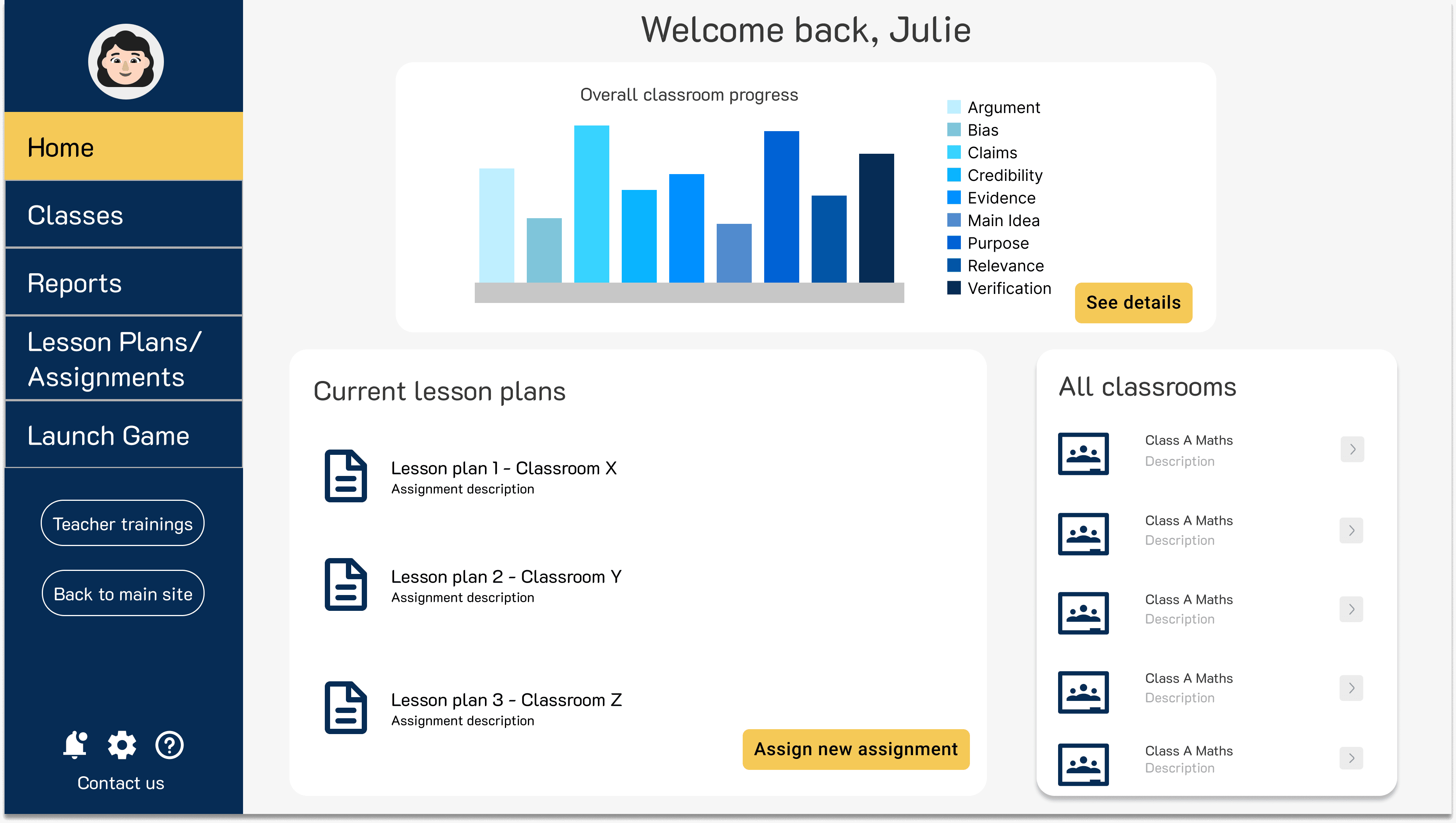
The new dashboard

SPAM after incorporating user feedback
The results
I also made sure to audit for accessibility, as according to WCAG 2.1 AA compliance. To achieve this, I:
Introduced multimodal UI patterns (using distinct iconography and text formatting) to ensure data-dense metrics were fully legible for colorblind or low-vision users
Redesigned microcopy to remove cognitive barriers, ensuring complex analytics were clear, intuitive, and immediately actionable for teachers of all technical backgrounds
To guarantee a smooth developer handoff, I built a comprehensive documentation framework. I also documented the 'why' behind critical design decisions and recorded video walkthroughs of complex user flows to minimize engineering misunderstandings.
In the end, SPAM and the new dashboard were successfully implemented, which led to user adoption and retention.
