Advocating for and creating a design system
Audited and built components for Apryse's design system that decreased developer deployment time and maintained brand consistency without it becoming fragmented or inconsistent.
Overview
The problem:
Prior to this project, the design and development workflows were highly fragmented:
Design Inconsistency: multiple teams used different styling, component libraries, and interaction patterns, leading to a confusing and disorienting user experience across our product suite
Slow Development Cycles: engineers spent significant time recreating existing components or debugging styles
The success criteria:
Champion UX initiatives by effectively communicating business value
Establish scalable architecture using atomic design, tokens, and design systems
Bridge the gap between design, engineering, and product teams through collaborative documentation and shared tools
Phase 1: Advocacy & Buy-In
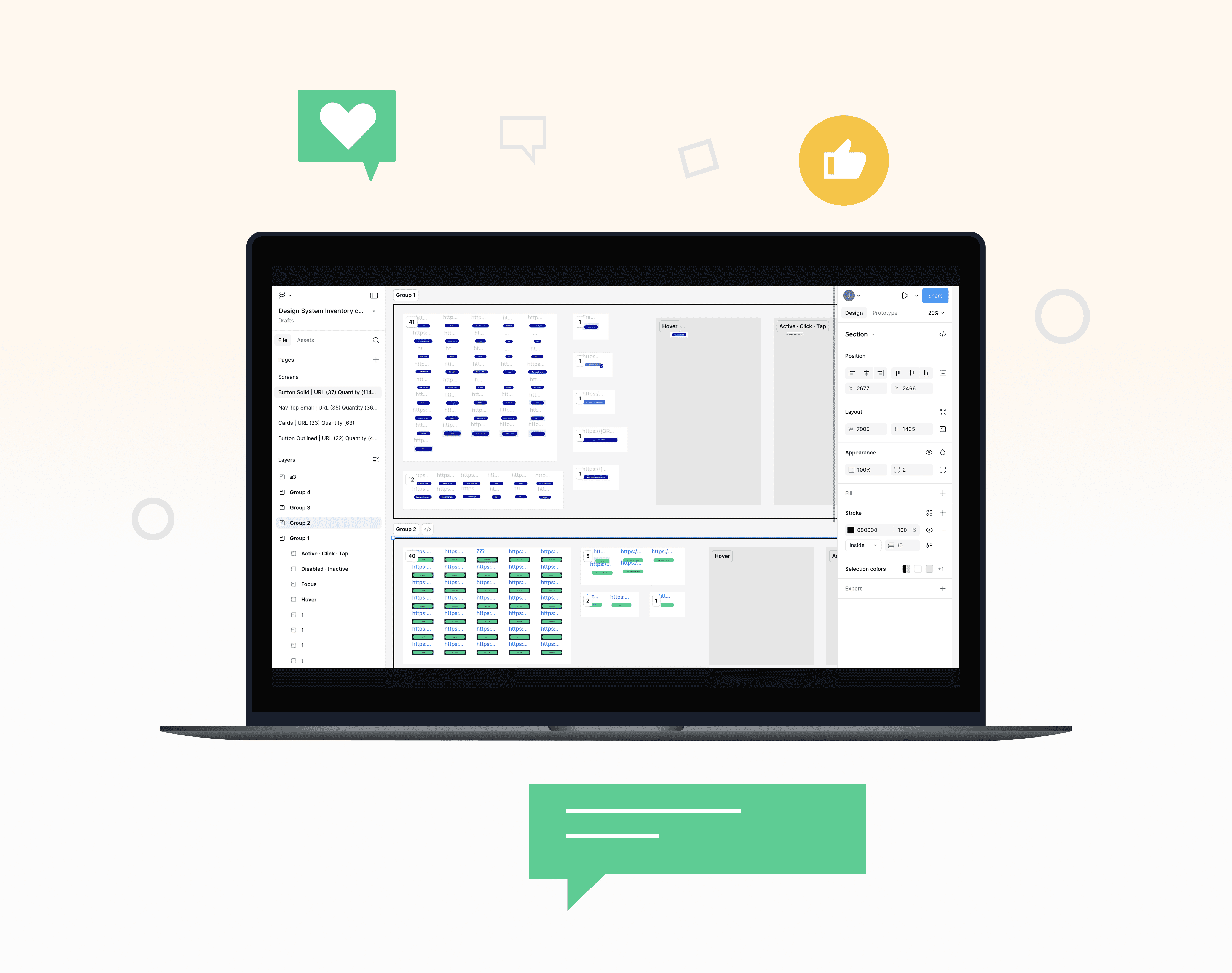
The first major hurdle was proving the return on investment (ROI). I conducted a design and development audit to visualize the problem.
Key Advocacy Artifacts:
The "Consistency" Visual:
I created a visual collage (a "Frankenstein UI") showcasing different primary button styles currently in use across our main products
Impact: This stark visual clearly articulated how the varying button styles could cause user confusion and additional cognitive load as well undermine brand integrity

Phase 2: System Design & Implementation
Key Design Decisions:
Defining Design Principles: I established three core principles that guided every component:
Clarity: Prioritize legibility and predictability.
Flexibility: Components must be easily adaptable for diverse use cases.
Accessibility: Adhere to WCAG 2.1 AA standards
Atomic Design Methodology:
Adopted the Atomic Design model (Atoms, Molecules, Organisms) to structure our library, ensuring scalability and reusability.
Documentation (The Source of Truth):
For every component, I typed up:
Component Overview
Usage Guidelines (Do's & Don'ts)
Accessibility Notes
The results
The most significant win was shifting our design team's focus from focusing on pixel-perfect styling to strategic problem-solving.
With the foundational UI handled by the design system, we gained back valuable time to conduct deeper user research and address complex workflow challenges.